Comments:
(Commenting only available during the rating period)
Cameron:
Right character is overacting in the beginning. Otherwise not bad.
Anirudh Sethu Prasad:
Very nice render and you've got some cool poses in there but the lipsync could use a lot more work
Derek Stewart:
Nice rendering and setting here. The acting isn't quite there yet and things are oscillating between overly cartoony and too stiff. I would focus the most on finding out what you are trying to say and really push that because at this point, I'm not sure what the point of the shot it.
Stafford Ahartz:
Lip sync is off by a few frames throughout the shot.
Mervyn Le MandarinOrange:
Overall animation has overacted..
Mahesh Waran:
a nod to the voice will fix this
April Slocombe:
Movements are not over do be but the lip sync seems a bit off and the man at the computer has a cliched pose at the end.
:
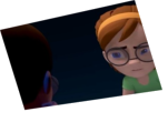
Hard to see the second character behind the computer with this lighting.
Alexis Dounce:
watch out for the illumination: the animation of the guy from the left before the frame 189 it is just fades with the background. The animation it seems in some way imperceptible. The light can be a great tool for composition, storytelling, and feeling in a scene, but if you don´t know how to use it, it can give you an unwanted result and affect your work.
Jayvon Gomes:
I wish the guy holding the papers varied his movements, seems very repetitive


Animator: Jamshid Noori
Description: I am Jamshid From Holland. Its my first time with competition.
Experience: One and half year
Time taken: twee weeks