Comments:
(Commenting only available during the rating period)
Arik R. Morales IV:
This one is just everywhere all at once and that doesn't really work with the dialogue.
Michael D. Smith:
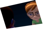
Too many stiff motion changes. Too many camera angle changes.
Jesse J. Jones:
Hahaha, I loved this so much!
Roger Crown:
Whooaaaaaaaaaaaaaa.....this is the exact opposite of char's in 3d rigs who float..................man these char's are doing the jitterbug.!!!!!!
Benjamin Berg:
Critique
1. Way too much movement.
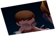
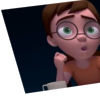
2. Poses don't match what is being said.
3. Too many camera changes. (It's best too keep the camera still in most occasions)
4. Both characters move at the same time at the beginning and makes it hard to see who is talking.
Calvin Kau:
Unnecessary movement
Aaron Rivera:
The animation is really jerky here. I think you were going for an over-the-top feel but it just feels too over the top with too many poses and movement that's too fast. As it is it kinda looks like a robotic interpretive dance on speed. If you want the extreme poses, you have to find good ways to accent it with some movements that flow to contrast with the snappy stops. The camera movements are also unnecessary. The scene probably would've worked better with just cutting to the third angle instead of snapping around the desk.
Sergio Barragan L:
are you kiddig me? this is terrible!!!
kishan Rathod:
Nice !!! funny


Animator: Merlyn San
Description: Please help advice.
Experience: several months
Time taken: a week