Comments:
(Commenting only available during the rating period)
Elle:
Its too bad you didn't incorporate the other character.
Samaphon Chunawat:
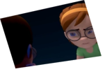
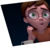
The animation is nice and fluid, very natural. Except for the ''Time'' expression/pose which i think its too much. The facial expression is very good as well/
Bryan with a Y:
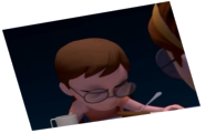
Love your arcs. It is possible the exaggeration is too far. Poses great overall, but I think the hand on the cheek is too high. If you just look at the silhouette, the hand would get lost in the head.
Samuel Bourland:
Great work. The expression on time seems a little out of place, especially his eyes, and he seems to rest his hand by/on his eye. But some great animation.
praveen kv:
Great...
Lea:
Nice shot, but I'm not sure about the pose he settles into on frame 130-140. It's not unheard of to rest your cheek on your hand, but it seems like his hand is too far up and not bent enough at the wrist to suggest that he's keeping his weight on it. Might also be the camera angle, but it's something to consider at least.
Rahul Rishikesh:
in the part he says 'that time' the acting looks overdone , like purposefully added that pose later.. ending is nice. overall one of the top animations.. :)
Ruud Harbers:
Nice one! You could have the character do something with his right hand from f150 until the other character speaks, like playing with the wood a little. It would enhance the boredom he displays.
Eric Solomon:
The hand that is leans against the face could be a little lower, to show off some cheek movement


Animator: Bartosz Jerczynski
Description: Kids
Experience: 5 years
Time taken: 3 weeks after work