Comments:
(Commenting only available during the rating period)
Carl Slate:
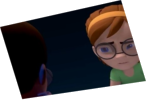
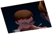
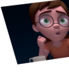
I love the motion in the interaction between the characters, and the angle you chose for the shot. Aside from tightening up the lipsync, I think if the character on the right would had slid the phone in his hand around to a natural holding position, like people do, it might have put this entry through the top. The awkward way he holds the phone before it is taken away kind of kills the believably.
Eddie Higgenbottom:
Your camera is very low! I like it.
Steve Reach:
Why don't we see the full faces? This shot takes away the ability to see the eyes, eyes are very important to express emotion. You give decent attention to the hands and fingers, can still use some work on them, but it's a strange camera angle that isn't working....it's not even centered. Why do we see so much table? The second half is better when the "right" guy is in a moving hold, as opposed to the first half when they're both moving at the same time and the audience doesn't know where to look.
Abisayo Oremuyiwa:
Nice but the drink is unreal, nothing in it.


Animator: Sheli Shapiro
Description: Two guys on a (what was supposed to be 'romantic') date...
Experience: About half a year
Time taken: About 15-20 hours