Comments:
(Commenting only available during the rating period)
Nicholas Ballard:
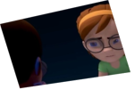
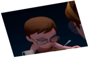
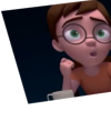
Ultimately, the staging would improve this piece by a lot. The characters just are not taking up much screen space and they are awkwardly cut off.
VAMSI TAMADA:
side please
Elisabeth Janerka:
Work on your composition and framing. The characters could easily be higher in frame and the horizon be most lower
Victor Fina 2:
So far out you don see animation


Animator: james ferridge
Description: something that I worked on in april, very rough around the edges. wanted to upload something rather than nothing
Experience: second year student
Time taken: one week on and off