Comments:
(Commenting only available during the rating period)
Andre Nunes:
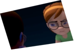
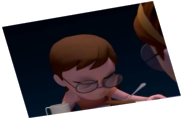
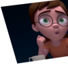
the lightning and the hairsimulation are very appealing, the facial animation could be better. nice work :)
Nassim Briedj:
a little bit scary
Kristopher Kendall:
The rendering is top notch, but the lip sync is a little bit off.
Michael Launder:
things feel very squishy i'm glad that you're experimenting, thats good, but it also needs to be toned way back haha its a beautiful interpretation of the audio as well!
Melanie Fumey:
Be careful when you're animating face/lipsync, Mathilda seems being a chewing gum, you've exaggerated so much the deformation of her face that we loose her initial face's shape sometimes.
Jez:
Nice face expressions & rendering
Florencia Irena:
It's nice actually but, the lip is a lil bit off and looks like you put too much movement with her chin
J.K. Riki:
The closer you get to a more realistic or highly polished look, the harder it is to achieve believable animation sometimes. Here the piece suffers a little from the great fluidity and rendering, since the lip sync doesn't match up quite right. You've got great movement in the face and features, now it just needs the mouth movements to match. Remember you don't have to use the tongue in every spot if it ends up being distracting, and here it's a little distracting at certain points. :) Overall, though, nice work, and I look forward to seeing future entries from you! Good luck.
Bryan Stone:
Not liking the facial expressions at the beginning, the transition is what makes this one good. Lip-sync is a tad off.
Harihara Shrinivas:
Lovely work but you are to be concentrated on the lips sync part
Dominic Rayner:
Try to define the visemes without drifting between them, because you have ended up with a rather liquid looking slurry of facial expressions. If you are going to use mood lighting, don't use it to hide the animation, unless you are not confident with what you are presenting. Some elements of the set and lighting are very nice though.
Michael Kristiansen:
Nice model, scene setup and render. But the face is too rubberlike for my taste. The tongue moves a bit too much as well I think. But well done animation overall.
Jean-Daniel Eugenie:
Maybe too much deformation on the face. And the lipsync need more improvement


Animator: Qinqing Wang
Description: the reality is not the same thing as what in her castle on the cloud
Experience: 4years
Time taken: 4days