Comments:
(Commenting only available during the rating period)
Tari Mack:
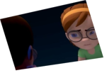
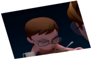
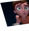
Nice subtlety makes this animation natural and believable. The expression on the screen right character from 35-160 is my favorite part. The screen left character from 0-130 is nice too. I wish the screen right character's sighing at 175 - 193 was more pronounced. The staging of this scene is nice
Jasmine Keith:
You've got good actions and pacing and the hands move wonderfully, but your animation is lacking a bit of punch. Push your poses a little more and add a little snappiness to your movements here and there. It could also help just to adjust the position of your characters to get a better silhouette. There's also a light moving around that I take to be a dance club type light but it doesn't look quite intentional enough. Right now, it's just kind of distracting. Seriously though, your actions are all very natural and nice.
Keith Sizemore:
You have great animation with the hands, which as all animators know is a pain in the ass; so kudos to you. One thing you should focus on is readability. The eyes are, if not thee most important focal point of a dialogue. I really recommend staging the face more open next time in order for the eyes to be easier to read. If you plan on lowering the face then make sure to have the camera lowered as well. Also try to keep your moving holds more alive. At one point the character screen left felt frozen after his initial dialogue. Maybe a small head shift or a noticeable eye dart will work well there. Those reactionary moments are great for some awesome subtle play. It gives you a chance at small interests for the character to show, like a lean in, or a head shift for a better perspective. When posing the fingers try to give them some diversity like a flat here or a bend there. If they're fully symmetrical and similarly posed they feel mechanical and not so much human. It's those small details that really push a piece. Another note on the camera; cut out all the unnecessary empty space. Push the camera in and make it a medium shot. This is an intimate moment between two people and needs a closer more intimate feel for the audience. That might mean that some of the hand animation wouldn't be seen, but this wouldn't be a problem if staging was addressed before blocking.


Animator: Sefa
Description: Is my first animation with two characters and my second acting.
Experience: 9 mounths
Time taken: 18 days