Comments:
(Commenting only available during the rating period)
Jason Wellings:
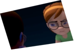
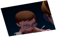
I think your anim is looking fairly good but it's hard to tell because of the distracting composition. WAY too much head space, camera too far away of oddly positioned etc. Next time pay a bit more attention to composition it'll go a long way. Best of luck next time :)
Alberto Fernandez:
The pull of the trousers at the beginning hah!
I think the clip could benefit in general from a more controlled camera setup: it's a bit misleading, jumping planes hence the eye is having a bit of trouble at locating everything.
jf barthelemy:
the animation is so much better than the composition! why is there so much space over their head
GLTC:
Camera angle could shows more of the background than the characters, dont have it angled pointed towards the ceiling but more at eye level
Stéphane Sartori:
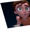
That's some very good animation. However the camera is way too far and the characters are very small on screen. You could also rotate the camera down on every shots so we don't see so much of the ceiling. And last thing, on the third shot ( where there's only the guy with the moustache) You could centre the character a little bit more so he isn't so close to being off screen. Very good animation though :)


Animator: Nitin Kuldeep
Description: Two friends has some past grudges so while having a casual talk they get into a fight
Experience: 2 years
Time taken: 8 days