Comments:
(Commenting only available during the rating period)
Lecomte Steven:
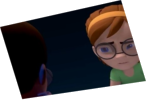
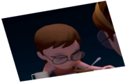
That's a shame those sripes spoil your animation (They are maybe too contrasted considering your sequence is black and white) it looks so cool but we want to see the whole thing without those ! Awesome work tho!
Thomas Dibet:
These stripes are hiding your acting. Make them more "transparent"
mowanie:
The giobos might have worked if the weren't this distracting. Nice setup though.
Shamel Esmaeil:
Nice animation, but I have to say the shadows are very distracting. It might help to bring the contrast down quite a bit.
jf barthelemy:
the lighting makes it harder to read
Stéphane Sartori:
It seems nice but I can't see anything because of those dark stripes. You could try toning that down a bit. I think a Playblast would have earned you more points.
Robert Firestone:
It's a good concept, but the lighting makes this really hard to read.
Haritz TZ:
The shadows is a bit distracting, can't see the animation well.
John Tyson:
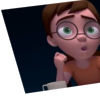
The movement is great, especially the guy's head. The second guy looks kind of weird just repeatedly point though, maybe try another gesture or a different one.
Anuj Sharma:
so good :)
Alberto Fernandez:
At the beginning it looks like the character walk slightly faster than they should, as if it's intended to fit with the old noir films style, to me that's nice. When saying "miserable, loneluy unhappy man" the 2nd character seems too mechanical, as if you used the same poses onwards and backwards, rotating only 1 axis; a bit of variety or different rythm would make it look more natural.
And also, to my eyes, once the main character puts his hands on the table for good, he doesn't move them and they look like pinned a bit. I bet you realized it and ran out of time for more detail, because I see how you nicely tweaked his right hand from 133 to 143 when moving it.
PRIYA RANJAN DEB:
Those shadows r disturbing.. can try off them..


Animator: Hector Linares Mateo
Description: Just one more day at the agency.
Experience: 2 years
Time taken: 3 weeks