Comments:
(Commenting only available during the rating period)
Alberto Fernandez:
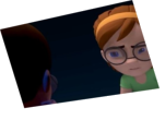
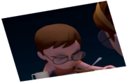
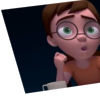
It's nice to see some exaggerations and deformations in general. To me the weakest part is between 65 and 125, too much movement in the main character, and I feel constant movement makes it look very regular, as if stretching or shrinking the timing on the head and hands would make it more rythmical. That, or remove weak poses and give others more time. 21 might be more powerful than the following 28-33; the tapping of the chest (around 70) might be more powerful than "both hands on chest" (a very typical idea when you hear -bottom of my heart- I believe).
Moreover, perhaps some heads cartoonish changes are a bit off, but I believe this is personal taste, eventhough I like it. Check 56-57, to my eyes it's a different head. Perhaps it's mostly the quality of the line.
I know the idea of the mirror is a very common one, but it looks ok here, and the can idea gives somewhat a deeper meaning. As the left hand indicating at his own chest.
Cheers.
Rukariro:
This vaguely reminds me of one of Michael Jackson's songs. HMMMMMM..... I WONDER WHAT IT COULD BE????
HINT HINT: https://www.youtube.com/watch?v=PivWY9wn5ps
Awesome, man!
Daniel Miller:
Lip sync could use a little more work. The jaw looks like it’s trying to catch up with the head when they’re talking
PRIYA RANJAN DEB:
Nice concept..


Animator: Will Oyowe
Description: Iam bad at character design so decided to focus on the acting instead for this one. Please if you have time CandC are welcome
Experience: 2 years
Time taken: a week