Comments:
(Commenting only available during the rating period)
Ben Zingo:
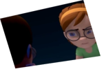
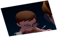
in the first shot, her hand on the left seems a bit awkward, people don't hold tablets with their pointer finger touching the screen. Her foot is also very bright in an area of high contrast, so it's a little distracting.
The guy's eyes are very open, I'm not sure if that's part of his design..? But if you pause at any point in the video, they look surprised/bulging, so I would suggest just lowering the lids a bit to give a more relaxed feel.
On the note of eyes, I think both characters could use one or two blinks
Your lipsync/mouth shapes could also use a little work, I think in particular, the horizontal movement of the corners of the mouth could be more expressive.
Body movement all feels very fluid though, and I like the anticipation/overshoot when you move the shoulders
Leonardo Rivera:
You did a great job on the girl but the guy looks a bit lost. I didn’t register that he’s watching Tv so it looks like his eyes are swimming around. Might’ve been better to keep him in fewer poses.


Animator: Subrata Bera
Description: A Boyfriend and Girlfriend Is talking each other about their photo. And The girl saying she is not looking good in this photo.But the boy trying to understand that She Is looking good......
Experience: 3.5 Years
Time taken: 40 To 50 Hours