Comments:
(Commenting only available during the rating period)
Jonathan C.:
Cool effects...but the actual animation was difficult to see because the camera was so zoomed out.
Niklas Bergwall:
Nice effects! Would have been nice to see some more close up body acting though.
JOYAL T. XAVIER:
here you get audience attention more on the visual effect...i think you need to show the character a bit more closer...here the character is almost invisible....good try.
Jerry Graham:
Great render, animation on the speaking character not so good.
James Trimm:
He's too far away for the soundclip
Justin Jones:
Everything is way too far away in the shot to really see much.
Alex Mlqd:
I think it will be better if we can see the acting/lipsync/animation of the character. Next time, try to have your main character who take a lot of place on the frame.
Robert Huffmon:
Can't see the character animation or lipsync very well. A close up camera would have done a lot for this.
Yuri Marcel Vieira:
nice work with the holograms, though the camera doesnt really help to see your animation
Nishith:
this is not a vfx competition...!!!
anyways nice fx..
Paula Decanini:
The effects were cool, but I couldn't really see the character animation as they were so far away.
Sarah Johnson:
The effects are impressive, but this is a character animation competition!
ben malberg:
This reminds me of star wars. Very cool with the effects. I wish I knew how to do that. :) As far as the animation goes I was hoping you would cut in close so I could see him closer and get a better feeling of his character. I'm not sure why you cut at around f320. Maybe not necessary.
Oliver Pedersen:
Cool effects but I can't see any acting as the shot was way to zoomed out from the characters to see what they are feeling and their acting
Paul D. Cooke:
It looks like it would have been great if I could have seen it -- it's way dark
Jordan Campbell:
Those lights sure are fancy. I just wish I could see the animation of the characters a little better.
Brent Forrest:
Cool dynamics bro
Kristian:
Nice set but the composition makes it hard to read. Try to show off the animation better.
Joyce Makker:
Not much of an animation entry, more of a vfx one.
MartyB:
Don't see much animation other then the spere in the middle
Sandra Tapia:



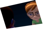
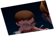
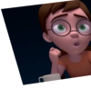
Animator: Christopher Stout
Description: Its a meeting about spheres and circles. As the boss explains to their employee about how different see things. Kinda wish it could be enlarged to be able to see him talk.
Experience: 2 years
Time taken: 2 weeks to put set together 1 week to animate