Comments:
(Commenting only available during the rating period)
Ramsey Parks:
Looks good, but I don't think that shot in which they were silhouettes was really necessary. It just doesn't fit.
Adrian Winchell:
Very artsy, and 2D, which I like. :) This would be SO much better with just some work on the lipsync. As it is it's so off, particularly in the beginning, that it's distracting - like a cartoon that's been dubbed from a very different language.
Alice Reeve:
Nice drawings. I think they could be a lot more expressive in their body language and lip sync.
Richard Adams:
Problem with woman's lip-syncing, waiter has too much "indication", bodies need to move more. Otherwise really nice effort!
Léo Miche:
I don't understand why there is a silhouette shot in the middle.
Robert Zhou:
Nice! Not sure why you did a silhouette there, but sure!


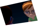
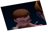
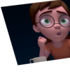
Animator: Nick Canton
Description: A high-scale restaurant has some modernizing to do...
Experience: A few months of self-taught
Time taken: 15-20 days of at least an hour a day