Comments:
(Commenting only available during the rating period)
Travis Wong:
you should probably focus more on the character animation more than your camera ^^
Cory Parks:
Lighting is nice, but where is the party?
Chris Tarrant:
Some very un-natural camera movements there. Try to mimic how a camera would move in real life. Often it's better to keep it stationary.
Meme Candia:
el movimiento de la cámara es extraño, no es realmente beneficioso
Jesse Angri:
You should really not animate the camera unless you have a good reason to. I don't understand what you were trying to do there.
ben malberg:
It's a nice set and lighting. I think there's too much camera movement. I would bring the camera closer and focus more on the poses and body mechanics of the character. I like your idea to have her fall at the end.
Jez:
A nice try with those camera moves but no cigar
Les Watters:
I would not have moved the camera at all!
Sarah Johnson:
Focus on animating the character instead of the camera!



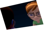
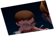
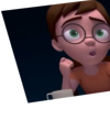

Animator: Riley Horne
Description: Here's one of my first animations I've seen through until the end. This includes setting up a scene and lighting it, as well as actually rendering the animation. I hope you like it!
Experience: 1 year
Time taken: 15 Hours