Comments:
(Commenting only available during the rating period)
Cameron:
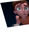
Needs a lot of work on lipsynch
Garrett:
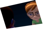
Nice idea! Wish the framing allowed us to see the character inside the TV more though. I also wish the acting wasn't so symmetrical a lot of the time.
Mervyn Le MandarinOrange:
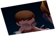
The hand action should be offset a little..
Craig P. Smith:
Looks like a good start, but I don't read the scene. What streams are they talking about and why do each of them feel the way they do about it?
Kristin Turnipseed:
Looks like it needs more passes and the camera jumps a bit too much. I like the idea though
hamid:
it's compleletly pose to pose it shouldnt be make it more straight ahead less tween and not all thing come together at the same time also see the eyes and eyebrows they are looks tweening too also give the head perspective it's make your animation not flat
Janice Liu:
cool idea! lip sync needs work..
Sophie Bracmard:
The animation need work and the acting isn't really natural.
Wolfgang Haas:
You have too much indicating going on, I fear.



Animator: Romane Biamby
Description: Your critic matter.
Experience: Student
Time taken: Two Weeks