Comments:
(Commenting only available during the rating period)
Jesse J. Jones:
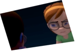
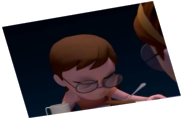
The woman's pose is very symmetrical and "twinny" from fr. 200 onwards. Try something more natural and less cliched. His hands at fr. 144 look like they're almost at zero pose, the could also be posed more naturally. He's got some shoulder issues as well here, maybe you need to move his collarbone control to keep it from pinching like that.
donna:
nice acting :)
Clement:
Thanks for daring some interaction! Too bad during that moment the animation seems to float, with no real rythm or intention. It makes the reaction of the girl look very empty. The final animation of the man may be a bit repetitive, but really stresses the tone, good point!
Andy Fallon:
skinny hulk! i like it
Blond:
+1 for the setting and story!
Work your animaiton though!
Monika G:
Nice idea!


Animator: Mike W
Description: Somebody's reflection got them busted!
Experience: 2 years of school
Time taken: 2 weeks on and off