Comments:
(Commenting only available during the rating period)
John M:
Cool liquid movement in the glass. Great facial movement. Nice all round. Well done.
Adam Watkins:
I loved every second of this one! From the water effects to the elasticity of the man's face when he smeared it with paint. 11/11
Genemart Adrenal:
nice work man, but still feels those IK when holding the glass. "NO" need hand pose, looks too default or not too appealing
Nikolai Jonasson:
Really nice callback to the latest Joker movie and the play on the double personality is very effective! The 3D animation is masterfully done with great attention to the facial expressions, textures and lighting.
Benjamin Mark Thickett:
That is actually mental. Like really good, that splashing animation for starters and the idea is super complex on it's own and executed with shear perfection. great work!
Alvaro Alfonso Jiron Garro:
This is awesome. I love the story and acting, the contrast between the good and evil sides!
Edoardo Sartori:
Wow. A lot of simulation.
Catherine Lachepelle:
Most of the animation is great! However, the drink is a little distracting, and the storyline is hard to understand (who's the reflection, who's the character). It's also a little too obvious that the drink hand is in IK around frame 100. But it's very fluid and appealing.
C h o c o b i l l y :
Creepy!! Nightmares coming up. Pretty cool interpretation. Well done.
Jamie F:
The hand is doing some really strange things and you can see that's it's in IK, and doesn't match the simulation of the drink sloshing about. This would also work with some holds to break up the movement.
Robert Cartwright:
The hair just seems a bit too springy, like it sways a little too fast. Otherwise lovely job, the work you put into this must have been tremendous!
Carlos:
Yoker is amazing!! good job!
Elisabeth Janerka:
Nice setup, but having the most of the scenen directly from the side with the character mainly turned away from camera is a shame
Tiffany:
I referred the clip you posted on the forum. This was kinda confused. Shame because the animation is quite nice.
Gabriel Mira de Assumpção Peixoto:
Very good animation-wise, but the switch between makeup and no makeup on the second line is a bit jarring; maybe it would be better if it didn't happen onscreen.


Animator: John Toland
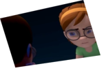
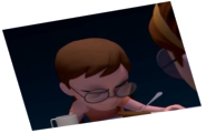
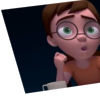
Description: he Joker is losing to his inner demons, and Mr Fleck is trying to fight him, But the Joker wins and Mr Fleck is but a reflection, and no longer his true self.
Experience: 4 yrs
Time taken: 30 hrs